Seamless, Mirror and Half-Drop: What Pattern Repeat Types Actually Mean
A pattern file is only ever one tile. Nobody sees the tile. They see the wall, the shirt, the wrapping paper — and what they see is decided by the repeat structure underneath. Set a small sprig of leaves in a straight repeat and you get order, rows and a quiet rhythm. Set the same sprig in a half-drop and it starts to wander across the surface as though it grew there. Same artwork, same palette, a completely different print. Repeat type changes a finished surface more than the drawing does, and it is also where things quietly go wrong: a seam, a stripe, a grid that the eye finds before it finds the motif.
Straight repeat: the honest grid
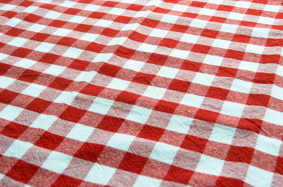
The straight repeat — sometimes called a block or basic repeat — places the motif in rows and columns, every copy in the same orientation, facing the same way. The tile is a rectangle, and when you butt copies together the pattern continues seamlessly.
It is the simplest structure to build in any software, and for certain jobs it is the right one. Geometrics, stripes, checks, small all-over dots and anything that must line up with a grid all behave well. The straight repeat keeps its promise: what you see in the tile is what you get across the wall.
The risk is gridiness. Because every motif sits at the same height and the same distance from its neighbours, the eye stops reading shapes and starts reading rows. At a small scale those rows can turn into stripes from across a room. Ways to soften it: give the tile more air, vary the size or rotation of motifs while keeping the grid intact, or add faint background texture to break up the empty spaces. A straight repeat does not have to look stiff — it just needs internal variety.
Half-drop: the quiet fix for a fussy grid
In a half-drop repeat, every second column of motifs is pushed down by half the height of the repeat. The motifs stay upright; only their position shifts. Nothing about the drawing changes, but the whole surface begins to move.
Half-drop is the backbone of traditional wallpaper and textile design. Damasks, trailing foliage, fruit, chinoiserie branches and most of the florals you would happily live with for twenty years are built this way, because the offset creates diagonal flow instead of rows. It also hides the repeat line well, which matters when motifs are irregular and the eye is hunting for rhythm rather than geometry.
Two things to watch. First, half-drop makes a busy surface when motifs are dense, so it often needs more space than a straight repeat of the same artwork. Second, if you are designing fabric that will be cut into panels, cushions or quilt pieces, half-drop is harder to fussy-cut — the motifs never sit in a neat stack. For anything that will be cut, straight or brick gives the maker more to work with.
Brick repeat: staggered, sturdy, slightly casual
A brick repeat shifts every second row sideways by half the motif width — or by a third or a quarter, which is where half-brick and third-brick come from. Think of a garden wall: the joints never line up, and that is the point.
The bond between half-drop and brick is worth remembering. They are the same operation on different axes: half-drop offsets columns, brick offsets rows. Rotate your artwork by ninety degrees and one becomes the other.
Brick suits small motifs and mid-century or utility prints, and reads as more relaxed than the same motif repeated straight, because the stagger stops the eye from counting. Do watch for unwanted diagonals: brick can throw up a staircase effect if the motif is bright or large, and rows that sit too close together can band. Shrinking the motif slightly or increasing the vertical gap usually settles it.
Mirror repeat: symmetry, with consequences
A mirror repeat flips the tile along one or both axes. Mirror the tile vertically and each copy faces its neighbour like a reflection; mirror both axes and you get a four-way symmetrical block that reads as kaleidoscopic, heraldic or architectural. Mirrored repeats are wonderful for ornament — medallions, tiles, decorative borders, wallpapers that need a strong central axis — and they give you perfect edge matching for free, which makes them a useful fallback while you are learning to build tiles.
The consequences are real, though:
- Any asymmetry in the motif gets doubled. A horse facing left will face right in the neighbouring tile, which may look deliberate or may look like a mistake.
- Directional marks are dangerous. Lettering, birds in flight, arrows and anything with a clear front will flip.
- Texture mirrors too. A loose brushstroke or a torn-paper edge will show its mirrored twin, and the join can look contrived.
- The mirror lines become visible symmetry axes, so the print settles into a formal, almost printed-panel look rather than an all-over one.
If you want symmetry without the full flip, mirror in one direction only, or use a mirrored half-drop, which offsets as well as flips and softens the effect considerably.
Tossed, ogee and other layouts worth knowing
A tossed repeat scatters motifs at different angles and positions with no obvious rows. It reads as natural and relaxed, and suits florals, children's prints and anything that should look hand-scattered. It is also the hardest to build: the placement still has to be engineered so every motif crossing an edge reappears correctly on the opposite side, and the scatter must avoid accidental clumps and bare patches.
An ogee layout uses S-curves to create a lattice of wavy diamonds, usually built on a half-drop. It gives a print a traditional, upholstered feel — damask and heritage wallpaper — and is a good option when you want structure without straight lines.
What each repeat does to the finished print
Reduce it to feelings and the choice becomes quicker:
- Straight: ordered, tailored, calm. Good for geometrics, stripes and stationery.
- Half-drop: flowing, generous, traditional. The natural home for foliage and large florals.
- Brick: grounded, casual, slightly retro. Excellent for small motifs and tile-like patterns.
- Mirror: formal, symmetrical, decorative. Best for ornament; risky with directional motifs.
- Tossed: relaxed, organic, playful. Ideal when the print should look scattered rather than arranged.
Scale matters as much as structure. The same half-drop tile printed at two centimetres across will read as texture; at twenty centimetres it becomes the subject of the room. Decide structure and size together, then test them at the scale the print will actually be seen.
Testing the repeat before you commit
Once the tile is built,
Photo: BRRT / Pixabay

You Might Also Like
A practical guide to re-engineering one repeat so it works at stationery and furnishing scale. Keep the rhythm, redraw the detail.
How digital and screen printing compare for a first fabric run — setup costs, minimums, colour limits and hand feel, plus the questions to ask before you commit.