Scaling a Pattern Across Products: From Greeting Cards to Upholstery Fabric
A pattern that sings on a greeting card can look timid on a sofa, and a furnishing design shrunk to card size can turn into mud. The motif is rarely the problem. Scale changes what the eye can read, what the printer can hold, and how the repeat behaves across a surface. Resizing is not one slider; it is a re-engineering job.
Begin with the repeat, not the rectangle
Before you enlarge anything, understand the tile you already have. Is it a straight repeat, a half-drop, a brick, or a tossed layout? Note the repeat dimensions in centimetres, and mark the pivot points where motifs meet the edge. Those joins are where scaling problems show up first.
A card might use a 6 cm repeat across a 15 cm square. The same tile on an upholstery fabric could need to become 30 cm, 45 cm, or larger, depending on the fabric width and the look you want. That does not mean every furnishing pattern needs a huge motif. Some small repeats work beautifully on chairs. The point is to choose the repeat size for the surface and the making method, then redraw the tile at that size. Enlarging a small file rarely gives you the control you need.
Keep the rhythm, rebuild the detail
At card scale, fine lines and tiny dots create texture. At furnishing scale, those same marks become isolated events. A delicate stipple that read as a soft grey may become a field of scattered specks. A hairline stem may look wiry or disappear entirely.
Decide which elements carry the pattern: silhouette, spacing, colour blocks, or a particular motif. Those are the parts to protect. Everything else can be simplified. Redraw rather than scale. If you work in vector, you can rebuild curves cleanly at the larger size. If you work in raster, build at the largest size you will need and scale down for stationery, not the other way round.
A quick scale test
- Print the tile at card size and at the intended fabric size.
- Pin both to a wall and step back a few metres.
- Squint. Note what disappears, what shouts, and what turns muddy.
- Look again from close up. Check whether the detail still feels intentional.
- Adjust one variable at a time: motif size, negative space, line weight, or colour contrast.
Redraw for the surface and the process
Greeting cards are usually printed digitally. They can hold fine detail and many colours. Furnishing fabric has a different set of rules. It may be screen printed, digitally printed, woven, or knitted. Each process has its own tolerances.
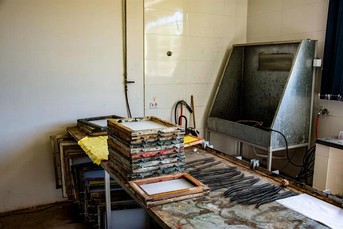
Screen printing on fabric often uses a limited number of colours. Registration can shift slightly, so tiny gaps between colours may close up or open. Overprints need planning. Woven fabric builds pattern from yarn, so very fine lines may disappear into the weave. If a design relies on delicate white lines, consider widening them or turning them into a stronger contrast.
Fabric width matters too. A repeat that sits neatly on a card may leave awkward gaps or crowded edges when it meets a seam. Think about how the pattern will be cut and positioned. A half-drop repeat can soften the effect of seams; a strong straight repeat can create vertical bands that either support the furniture shape or fight it.
Adjust the repeat structure for the new scale
When motifs grow, the number of repeats across a width falls. A card might show eight repeats across its face. A sofa cushion might show two. That changes the character of the pattern. A design that felt busy and generous can suddenly feel sparse. A design that felt elegant can become overwhelming.
You may need to add a secondary motif, open up the spacing, or change the repeat structure altogether. Negative space becomes a shape in its own right at large scale. If the pattern feels empty, add a small coordinate motif between the main ones. If it feels dense, remove elements rather than shrinking them. The goal is a repeat that holds together across a metre of fabric, not just across a card.
Colour, contrast and separation
Colour behaves differently at different sizes. At card scale, two close tones may read as a single texture. At furnishing scale, they separate into distinct bands. You may need to adjust contrast, but not always by making everything louder. Sometimes reducing the number of colours creates a stronger design.
For screen printing, each colour usually needs its own screen. Fewer colours can mean fewer registration problems and a cleaner result. For digital textile printing, the fabric base affects how colour appears. A pale grey may look warmer on linen and cooler on cotton. Always ask for a strike-off or sample before committing to a full run.
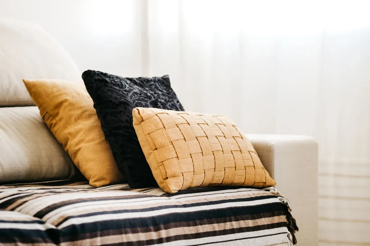
If you are designing for upholstery, remember that the fabric will be seen from across a room and from close up. Pattern needs to work at both distances. A design that only reads from three metres away may feel empty when you sit on it.
Proof at the right distance and in the right light
A screen is not a sofa. Print proofs on paper, then on fabric if you can. Drape the fabric over a chair. Look at it in daylight, not just under a desk lamp. Check the repeat joins by butting two copies together. Walk around the room and glance at it from the side. Directional motifs can create a strong sense of movement, which may be desirable or distracting.
Document everything: repeat size, colour references, file name,
Photo: Jonathan Borba / Pexels
You Might Also Like
How digital and screen printing compare for a first fabric run — setup costs, minimums, colour limits and hand feel, plus the questions to ask before you commit.
How floral, geometric and zoomorphic motifs differ, and why committing to one family makes a multi-print collection read as deliberate rather than accidental.