A Beginner's Guide to Building a Pattern Colour Palette That Prints Accurately
Few things sting quite like opening a printed sample and finding your favourite coral has turned into something closer to tomato soup. The screen said one thing, the cloth said another, and a collection you had mapped out in your head suddenly needs rethinking. It happens to almost everyone early on, and it is rarely a design problem. It is a colour specification problem.
Building a palette that survives the trip from monitor to fabric comes down to two habits: keeping the colour count low, and testing the whole set on the actual material before you commit to a dozen designs. Here is how to do both without slowing your work to a crawl.
Why limited palettes hold up better
A palette of five to eight colours, including your neutrals, is easier to control at every stage. In screen printing, each colour usually needs its own screen, so every extra hue adds cost, setup time and one more chance for registration to drift. In digital printing, fewer colours mean fewer surprises when the printer converts your artwork, and less risk that an out-of-gamut bright gets quietly pulled back to something duller.
The benefits reach beyond the print table. A tight palette makes a collection look deliberate, lets you recolour a repeat in minutes rather than hours, and makes it far easier to spot which design is the odd one out. Restraint is not the same as dullness: depth comes from tints, shades, scale and contrast rather than from cramming in more hues.
Give every colour a job
Instead of choosing colours because you like them individually, assign each one a role. A palette that reads well on cloth usually has something like this structure:
- Anchor: the dominant colour, covering most of the surface. Often a deep tone or a strong mid-tone.
- Bridge: a mid-tone that softens the gap between anchor and accents. A muted green, warm grey or dusty blue does this well.
- Accents: one or two brighter colours, used sparingly. These are the colours people notice, so they need less space, not more.
- Light and dark: a near-white and a near-black. They give contrast and structure without adding new hues to the mix.
Where screen and print drift apart
A monitor throws light at you. Ink and dye reflect it. That single difference explains most of the disappointment. Screens are also brighter and more saturated than anything you can print, and a vivid lime, electric orange or sharp violet that looks crisp in your file may sit outside what a CMYK printing process can produce. What comes back will be close, but not identical.
Your own setup adds another layer of variation. An uncalibrated laptop display, a phone screen at full brightness and a printed swatch viewed under warm studio bulbs will all tell you something slightly different about the same colour. Judging a printed sample by looking at it on screen is a losing game, so don't.
Match the method to the palette
Digital textile printing converts your file to CMYK and handles gradients and fine detail well, which suits softer, more complex palettes. It is also the sensible way to sample before a larger run. Screen printing uses mixed spot colours, so each one can be matched closely to a reference, but the practical ceiling is usually around six to ten screens before costs climb sharply. Different fibres take ink differently too: the same pale blue can look fresh on cotton and slightly grey on silk.
Ask your printer which profile and substrate they recommend for the fabric you have chosen, and print a test of your actual palette rather than relying on a generic colour chart.
Test your palette before you commit
Testing is not a formality. It is the step that keeps a collection coherent. A workable routine looks like this:
- Lock a first draft. Choose your colours, note the values, and resist adding a seventh because one design feels flat. Fix the design instead.
- Build a test tile. Arrange your colours as solid blocks with a few tints of each, all on one page. Twenty centimetres square is plenty.
- Print on the real fabric. Not paper, and not a different base cloth. The substrate changes the result more than most people expect.
- Look at it in three lights. Daylight, indoor warm light and evening lamplight. Note which colours change character.
- Compare against the screen to see the direction of the shift, not to chase an exact match.
- Adjust and repeat. Plan for at least two rounds. Small tweaks to lightness usually matter more than large changes to hue.
Aim for a printed palette you genuinely like rather than a perfect replica of your screen. If a colour has shifted but the set still works together, you can often carry on. For commercial runs, confirm colour tolerances with your printer in writing before you sign off, since some variation between batches is normal and expected.
Record what worked
Keep a physical swatch card for every palette you print. Write down the digital values you used, the reference you matched to, the fabric, the printer and the date. Name your colours so you can talk about them: "Coral 04" survives a studio conversation better than "the pinky one". Store a working file and a separate print-ready version, and version them so you can trace what changed between runs.
Remember that reference systems do not translate perfectly between libraries. A conversion from one colour standard to CMYK will vary depending on the profile used, so treat any single number as a starting point rather than gospel. Your printed swatch is the authority.
A simple way to start
Pick six colours: one anchor, one bridge, two accents, one near-white and one near-black. Assign a role to each, note the values, and print a single test tile on the fabric you plan to use most. Live with it for a few days. Pin it up beside your sketches and see whether the accents still feel right on the fourth viewing rather than the first.
Then lock it. A palette you trust is worth more than one you keep second-guessing, and the designs built on it will be quicker to finish, easier to recolour and far more likely to look like a collection when they come back from the printer.
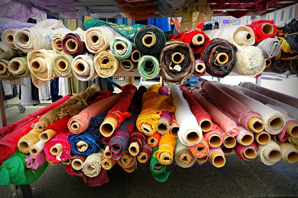
Photo: ulleo / Pixabay

You Might Also Like
A practical guide to re-engineering one repeat so it works at stationery and furnishing scale. Keep the rhythm, redraw the detail.
How digital and screen printing compare for a first fabric run — setup costs, minimums, colour limits and hand feel, plus the questions to ask before you commit.